How to Enable Dark Mode on Microsoft’s Outlook.com Webmail

Microsoft today is rolling out the much anticipated Dark mode for Outlook.com webmail. Here is a look at the new mode and how to enable it for yourself.
Microsoft this week is introducing a new Dark mode for users of its Outlook.com webmail service. Dark mode for Outlook has been a highly requested feature for quite a long time. In fact, a dark mode is starting to show up in some form in more and more places. Notably, starting with Anniversary Update, you can enable a dark theme in Windows 10. And plenty of mobile and desktop apps like YouTube and Twitter have adopted a dark mode and that extends to its websites, too. Microsoft is also working on a dark theme for File Explorer for the next Windows 10 feature update coming this Fall. Here is a look at the new dark mode for Outlook.com and how to enable it for yourself.
Turn on Dark Mode in Outlook.com
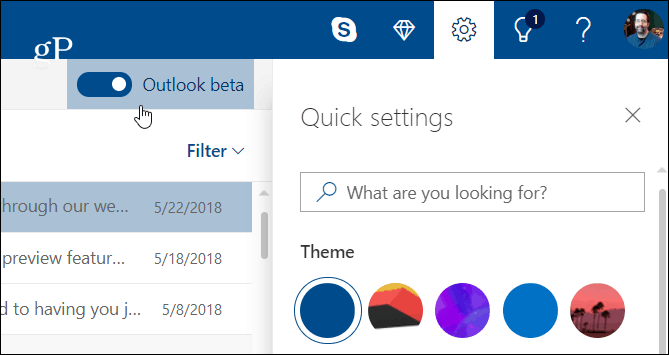
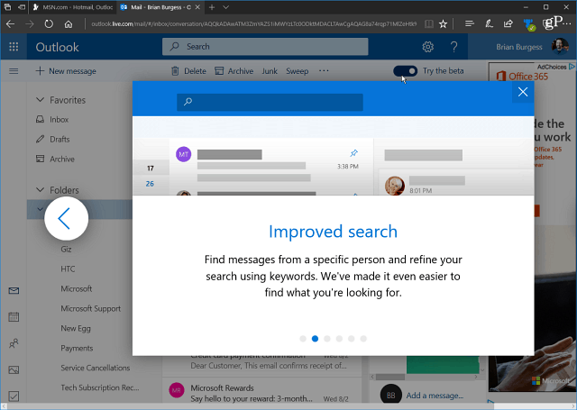
To have access to the Dark mode you need to be using the Beta version of Outlook.com. You can toggle that on in the upper-right corner of the screen if you haven’t already. Although, starting this week, the company is moving Outlook.com out of beta so this toggle should disappear in the coming days ahead.


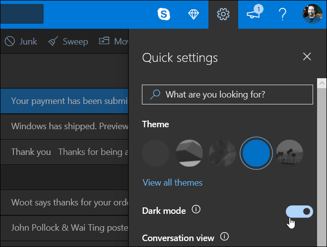
Head to Outlook.com in your browser of choice and sign in to your account. Then click on Settings (gear icon) in the upper-right corner of the screen. You will see Dark mode listed under Theme in Quick settings – just toggle it on. Note that most of the Themes in Outlook.com won’t work while in Dark mode. Currently, it only works with the default blue theme.


Outlook.com is now used by over 400 million users and Microsoft is in the process of introducing new designs and features for the service as well as the Calendar and Contacts sections. Note that Outlook.com entered beta back in August of last year. Since then, Microsoft has been rolling out new features piecemeal and not all of the planned updates are available to everyone yet.


In addition to the new Dark mode available today, Microsoft is promising an overall faster experience and more personalization with several more expressions, emoji, and gifs. The company is also working on making a smarter inbox experience that will show you suggestions as you’re typing. It is also adding an improved photo experience that will allow you to access sent and received images are available in a central location. Again, this is a massive rollout so if you don’t see it yet, just be patient as the redesign will show up soon.
1 Comment
Leave a Reply
Leave a Reply


Nicholas
March 13, 2019 at 1:26 am
And today they removed the Dark Theme with no accompanying announcement.