Photography Composition Tips
Photography is not just about holding your camera up to a great scene and snapping away. You need to think about what you’re looking at and compose a keeper IE: something you and others will enjoy looking at later. Today’s photography tutorial is a tip about composition in photography. My hope (and wager) is, if you follow these simple Composition tips, you will not only be able to take better photos or “keepers,” but you will also learn to enjoy taking pictures as your shots come to life! Let’s start with the most taught and talked about style.
The Rule of Thirds
This rule is perhaps the most commonly used “rule” that photographers learn and use. Just because it is a “rule” doesn’t mean that if you don’t use it, you’re doomed to have boring, lifeless pictures. However, most rules are put in place for a good reason so you should know why a rule is important before you decide to break it.
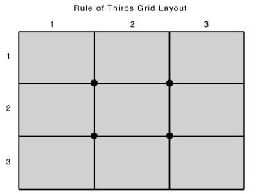
The basic idea of this composition style for the rule of thirds is to break your image into nine equal parts using imaginary lines to divide the shot into both three equal horizontal and vertical parts. The diagram below explains it much better than words.


You now have eight elements to work with, four lines and four intersections. The idea is to place your main subject on a line or intersection. This tip tends to make your pictures more dynamic and less snapshot looking. And this just isn’t me talking, research on the topic indicates that taking pictures using this process makes it easier for your brain to process the image and possibly, become more pleasing to the human eye.


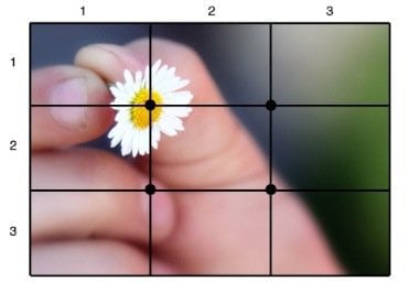
In this shot, the flower has been placed at an intersection and has become a focus of the photograph.
Below is another example of this. Notice how I placed the squirrel in the same spot as the flower above. Leveraging the rule of thirds plus paying attention to my depth of field, notice how great the shot looks.
The rule of thirds compositional style doesn’t just apply to having a main subject either. Remember you also have the lines of the grid to work with when composing your shot. Below is an example of using the lines of the grid layout to improve a landscape by following the rule of thirds. Of the two shots, which do you prefer?
Keep this rule in your back pocket during your post-production work as you can crop your images to apply this rule after the fact to improve the look and feel your pictures. So, now that you understand the rules don’t be afraid to break them! It’s not the only rule after all. Enjoy!
3 Comments
Leave a Reply
Leave a Reply


wpolscemamymocneseo
January 11, 2011 at 3:25 pm
As a Newbie, I am always searching online for articles that can help me get further ahead
MrGroove
January 11, 2011 at 5:06 pm
Did this one help?
brickmonkey
January 11, 2011 at 5:33 pm
Thanks. I hope this helps you to take better pictures. Let us know if you have any more questions.
Nathan